Google heeft zojuist het nieuwe bedrijfslogo gelanceerd. Het bedrijf heeft het nieuwe design meteen toegepast op alle producten.
De zoekgigant bestaat inmiddels al zo’n zeventien jaar en uiteraard is het niet de eerste keer dat het bedrijf de huisstijl verandert. Het allereerste logo van het bedrijf was bedoeld voor op een browser-pagina, maar vandaag de dag gebruiken we de producten van het bedrijf via veel meer apps en apparaten. Volgens Google werd het daarom tijd om het logo te veranderen, zodat het niet alleen goed past bij computers, maar ook bij telefoons, TV’s en horloges.
It doesn’t simply tell you that you’re using Google, but also shows you how Google is working for you. For example, new elements like a colorful Google mic help you identify and interact with Google whether you’re talking, tapping or typing. Meanwhile, we’re bidding adieu to the little blue “g” icon and replacing it with a four-color “G” that matches the logo.
This isn’t the first time we’ve changed our look and it probably won’t be the last, but we think today’s update is a great reflection of all the ways Google works for you across Search, Maps, Gmail, Chrome and many others. We think we’ve taken the best of Google (simple, uncluttered, colorful, friendly), and recast it not just for the Google of today, but for the Google of the future.
De timing van het nieuwe logo komt niet als een verrassing. Afgelopen maand maakte het bedrijf bekend dat het onderdeel zal worden van een nieuw moederbedrijf, genaamd ‘Alphabet’.
[gv data=”olFEpeMwgHk”][/gv]
Laatste nieuws


Populaire artikelen
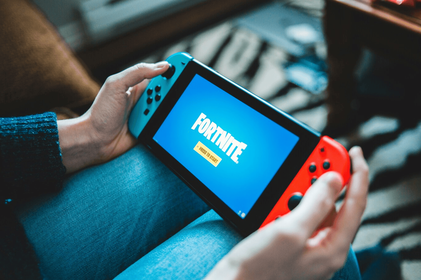
Fortnite Chapter 5 Season 3: einddatum en vooruitblik op volgend seizoen

Call of Duty: Black Ops 6: wat kunnen we verwachten?


Microsoft CEO optimistisch over toekomst van AI